
Let’s start by assuming we have a lot of data at our disposal: collected by sensors, purchased from some source or extracted from millions of web pages. We are very clever at storing them somewhere, and at feeding them to powerful machine learning algorithms, however, it is difficult to achieve any concrete results without an in-depth understanding of their meaning.
Take, for example, the table of the divisions of inhabitants by religion in the 20 most populous states in the world (you can find it at this address), and let’s try to ask ourselves which country has the highest number of Hindus in the world. Rather than scrolling through the table piece by piece and noting down this information, we could build a graph like the following, where we can immediately see the largest red rectangle (the graph can also be dynamic, as visible here).

That’s the point: whenever possible, visualization systems offer representations of datasets designed to help people make decisions more effectively. Visualization is the most suitable tool when you need to increase human capabilities, NOT to replace people with algorithms when making decisions. It is a very human-oriented tool: we do not need it when we have a completely automatic solution that we trust, but if we do not yet know what questions we want to answer, then it becomes an irreplaceable tool for analyses.
Why does it work?
Visual representation works because it allows us to create an external representation of things which we have inside our minds, and to bring them into the light. We basically replace cognition with perception. Let’s take this table:
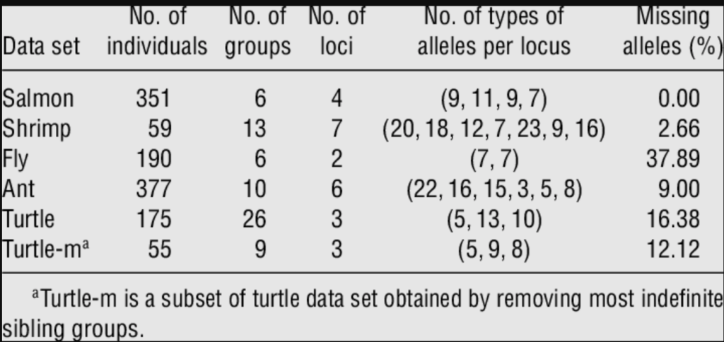
It is extremely difficult even for experts to understand: a human being is able to read a single number, the next and so on, but keeping track of everything in our minds is impossible because we do not have the capacity. A data visualization can help us find out what those numbers mean (and explain them to another human) .
What are the possible uses?
- Provide users with a tool used over the long term, such as exploratory data analytics.
- Clearly present the results found.
- Help model developers find and refine parameters.
- Find anomalies quickly.
If we can free our minds from the sequence of numbers, we can aspire to asking ourselves higher-level questions. Look at these two images:

Why is there a higher concentration of green dots in the second graph? This is exactly what the great American physicist Richard Feynman told an interviewer: he thought “on paper”. His mental process extended from his head to a physical representation of his ideas. A Feynman diagram summarizes an extremely complex phenomenon in a simple way: starting from all possible existing diagrams for a given interaction one can go “back” to the numerical calculation of a probability.

Another interesting example is the Anscombe Quartet, a group of four datasets that have identical statistical descriptions but completely different data distributions: this is evident when we go to view these distributions.

If 11 points are enough to generate this confusion, what can happen if the points are hundreds of thousands? If the data changes extremely dynamically? If we have data from heterogeneous sources that are mixing? A simple look with a human eye would be able to immediately discover this complexity.
To solve problems with data visualization
Be careful, however, not to believe that a visualization library with its army of charts is enough to find an answer quickly. Each pair formed from a data set and from the exact questions that we want to answer has its own characteristics, meaning that a particular type of chart that has solved problems so many times in the past can now become completely useless.
So what should we do when we face a problem within our viewing framework? There are four different levels to consider.
First of all, the application domain level: we know how important it is to be an expert. This is true not only for the software architecture: we need to learn to look at data the way domain experts do. Who are these experts? What are their expectations? What about their needs? In summary, try to put ourselves in the user’s shoes and conceptualize from their point of view..
But then we need to move forward because everything we have learned from the first level must be translated from the language of the domain to that of visualization (or software). The second level is that of abstraction. Abstraction of the data (understand what needs to be displayed) and abstraction of the questions (why the user is interested in that data). The most fascinating aspect of abstractions appears when we find similarities in completely different fields: finance and astrophysics, football and agriculture, etc. Although the specific vocabularies are very different, we find that from the point of view of visualization they are very similar domains. So, instead of trying random solutions, we should see if we have encountered a similar abstraction in the past.
The third level is that of language (sometimes defined as the technical level): how to show the data, while the fourth level is that of the algorithm: think of an efficient computation for the visualization of data.
Each level hides problems that need to be resolved
- Domain: We did not understand the user’s needs
- Abstraction: We’re showing the wrong thing
- Language: The way we’re showing data is wrong
- Algorithm: Code is too slow
It’s not trivial, because while we learned techniques to make our algorithms faster, we can’t say we’re also experts in cognitive psychology. How can we tell if we’re using the wrong language? If we’re drawing data in a way that doesn’t work for human perception? What about the first two levels? Can we say that we are experts in anthropology and/or ethnography? A farmer, a worker, an employee, they are all extremely different users.
Take a look at these news websites, where data visualization is used in a spectacular way to provide support to readers.
- Reuters Graphics Reuters Graphics – Charts, Maps, Interactive Graphics and Videos
- Do you want to understand if we are drowning in plastic? Drowning in plastic (reuters.com)
- New York Times Upshot (The Upshot – The New York Times (nytimes.com))
- The Pudding The Pudding
- Wine and maths: https://pudding.cool/2021/03/wine-model/
- FiveThirtyEight FiveThirtyEight | Nate Silver’s FiveThirtyEight uses statistical analysis — hard numbers — to tell compelling stories about politics, sports, science, economics and culture
Conclusions
Hoping to have intrigued you about the importance of this tool to solve problems, I think it is clear that at the basis of data preparation for our machine learning there is always a human component, the only one able to discern the importance of a single datum to solve our problem.
The graphical representation of the data is therefore the main tool at this stage, just because it helps human beings identify the questions, the problems that can be solved, and those that would not derive value from the data he is looking at.
Yet another demonstration that artificial intelligence provides the best of itself when working with human intelligence, continuing to be a support and not a substitute.
Keep following us!

Written by
Salvatore Sorrentino